
Provides a comprehensive overview of key metrics, performance indicators, and risk measures. The displayed content and available metrics vary depending on the selected ticker type.
1. Statistics & Risk Tab Content for Stocks
1.1. Valuation Measures Table
Displays valuation metrics with columns for the current value and up to 5 trailing quarters.
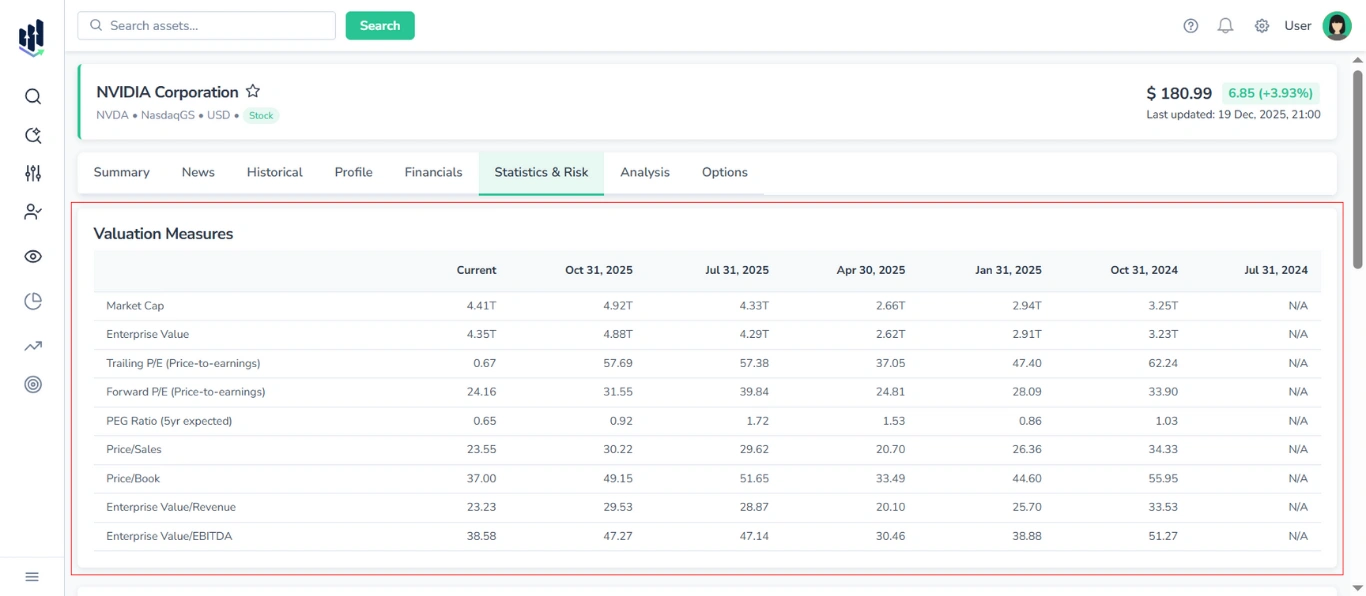
Shown metrics:
- Market Cap
- Enterprise Value
- Trailing P/E
- Forward P/E
- PEG Ratio (5yr expected)
- Price/Sales
- Price/Book
- Enterprise Value/Revenue
- Enterprise Value/EBITDA
Note: Although this table is conceptually part of Financials (serving as a summary of financial health and relative value), it is located in the Statistics & Risks tab.
1.2. Financial Highlights Section
Provides a summary of the company’s recent financial performance and position.
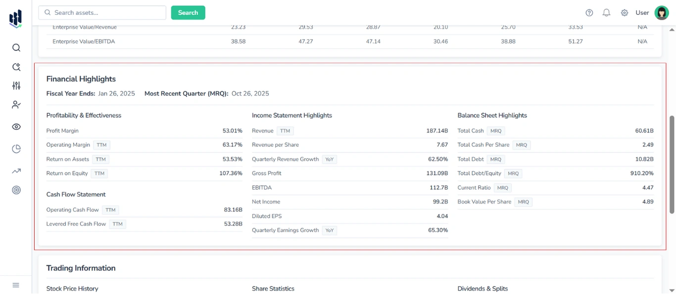
At the top of the block, the following context metrics are displayed:
- Fiscal Year Ends
- Most Recent Quarter (MRQ)
Thе Financial Highlights Section is divided into four main sub-blocks:
1.2.1. Profitability & Effectiveness Table
Displays key profitability and efficiency ratios, such as:
- Profit Margin
- Operating Margin (TTM)
- Return on Assets (TTM)
- Return on Equity (TTM)
1.2.2. Income Statement Highlights Table
Displays primary revenue and earnings data, including the following metrics:
- Revenue (TTM)
- Revenue per Share
- Quarterly Revenue Growth (YoY)
- Gross Profit
- EBITDA
- Net Income
- Diluted EPS
- Quarterly Earnings Growth (YoY)
1.2.3. Balance Sheet Highlights Table
Contains core balance sheet items. Typical metrics include:
- Total Cash (MRQ)
- Total Cash Per Share (MRQ)
- Total Debt (MRQ)
- Total Debt/Equity (MRQ)
- Current Ratio (MRQ)
- Book Value Per Share (MRQ)
1.2.4. Cash Flow Statement Table
Shows key cash flow measures:
- Operating Cash Flow (TTM)
- Levered Free Cash Flow (TTM)
1.3. Trading Information Section
Provides detailed data on recent price history, share statistics, and dividend activity for the stock.
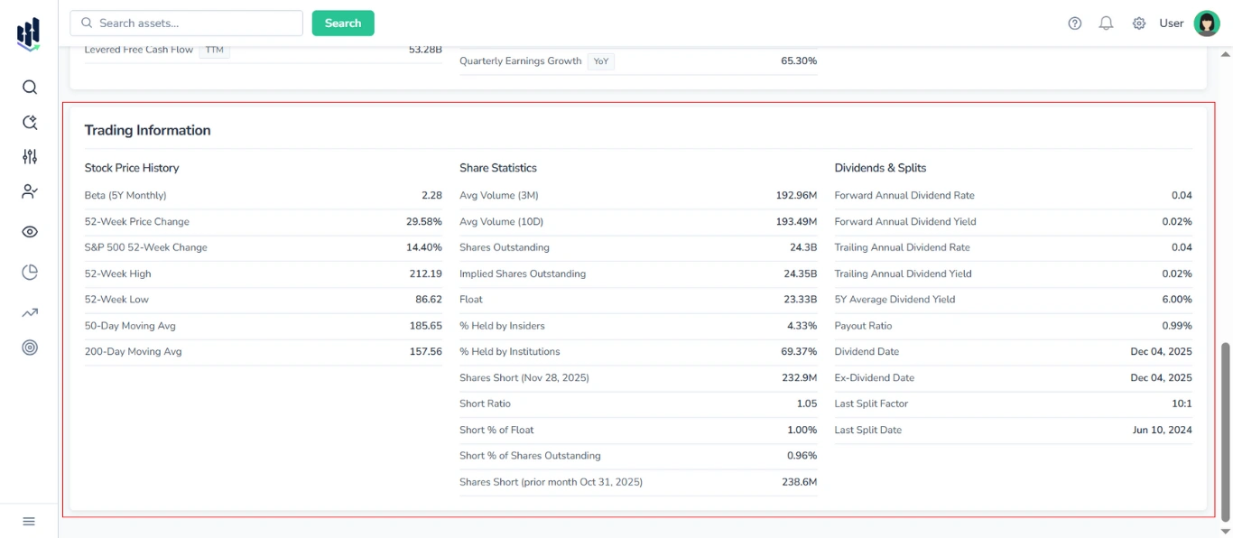
This section is organized into three separate tables:
1.3.1. Stock Price History
Displays:
- Beta (5Y Monthly)
- 52-Week Price Change
- S&P 500 52-Week Change
- 52-Week High
- 52-Week Low
- 50-Day Moving Average
- 200-Day Moving Average
1.3.2. Share Statistics
Displays:
- Average Volume (3M)
- Average Volume (10D)
- Shares Outstanding
- Implied Shares Outstanding
- Float
- % Held by Insiders
- % Held by Institutions
- Shares Short (with date)
- Short Ratio
- Short % of Float
- Short % of Shares Outstanding
- Shares Short (prior month with date)
1.3.3. Dividends & Splits
Displays:
- Forward Annual Dividend Rate
- Forward Annual Dividend Yield
- Trailing Annual Dividend Rate
- Trailing Annual Dividend Yield
- 5Y Average Dividend Yield
- Payout Ratio
- Dividend Date
- Ex-Dividend Date
- Last Split Factor
- Last Split Date
2. Statistics & Risk Tab Content for ETFs
2.1. Trailing Returns vs Category Table
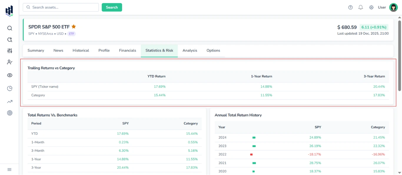
Shows the trailing returns for the selected ETF and its category benchmark across standard periods:
- YTD Return
- 1-Year Return
- 3-Year Return
The table contains two rows for direct comparison:
- The first row displays returns for the selected ETF (by ticker).
- The second row shows the average returns for the ETF’s category.
Positive values are highlighted in green, while negative values are highlighted in red, to visually indicate performance trends.
2.2. Total Returns vs Benchmarks Table
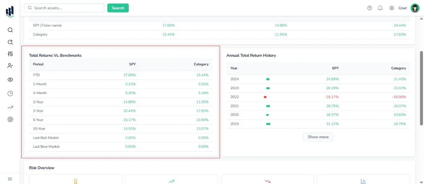
A comparison table with the following columns:
- Periods: YTD, 1-Month, 3-Month, 1-Year, 3-Year, 5-Year, 10-Year, Last Bull Market, Last Bear Market
- Ticker
- Category
To visually indicate performance trends, positive values are highlighted in green and negative values are highlighted in red.
2.3. Annual Total Return History Table
Displays annual returns for the selected ticker and its category.
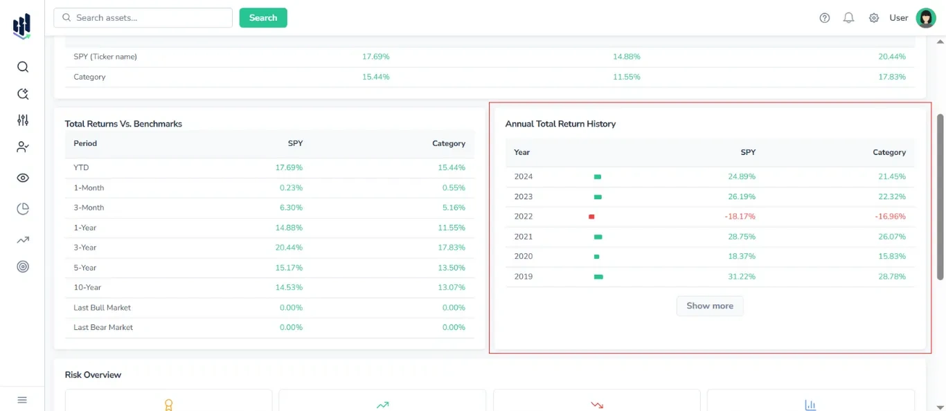
Columns included:
- Years
- Progress bar
- Ticker
- Categor
Additionally, to visually indicate performance trends, positive values are highlighted in green and negative values are highlighted in red.
Note: By default, 5-10 years are shown, click Show More to expand.
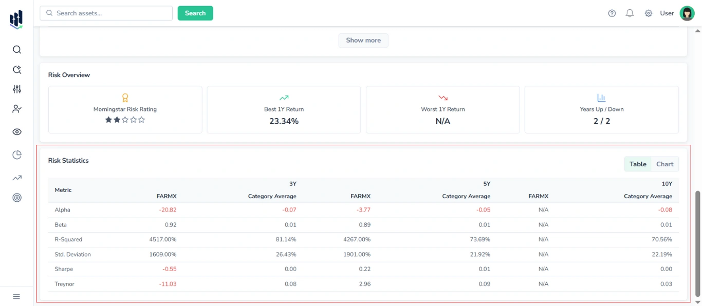
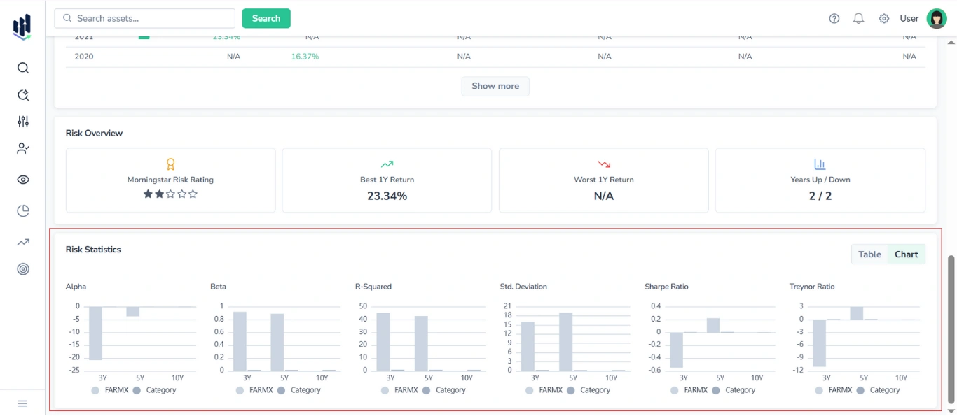
2.4. Risk Overview Block
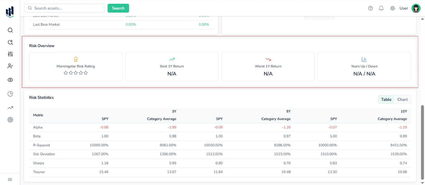
Presented as a set of four cards, it displays the following risk and performance metrics:
- Morningstar Risk Rating (stars)
- Best 1Y Return
- Worst 1Y Return
- Years Up / Years Down
2.5. Risk Statistics Section
Provides a comparative analysis of key risk metrics for the selected asset and its category benchmark, covering three time horizons:
- 3Y, 5Y, 10Y
You can switch between a table view and a graphical (chart) view of the data with the switcher in the top-right corner of the section.
2.5.1 Table View
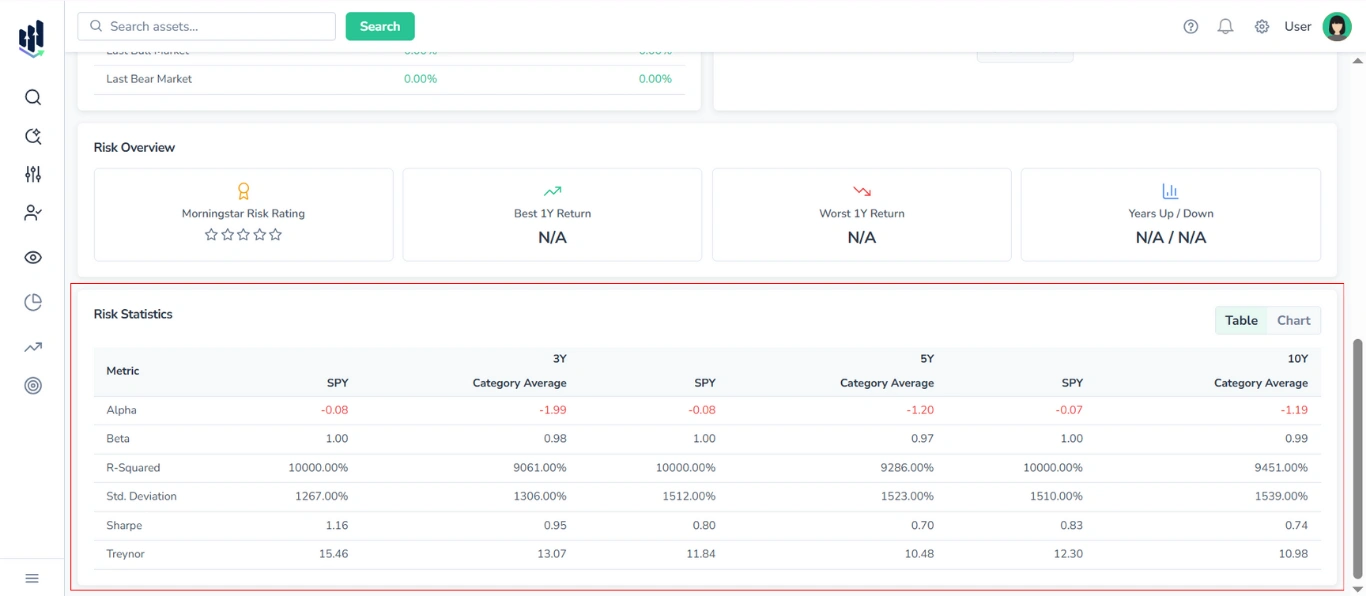
The table displays the following metrics:
- Alpha
- Beta
- R-squared
- Standard Deviation
- Sharpe Ratio
- Treynor Ratio
For each time horizon, two columns are shown:
- Selected ETF (by ticker)
- Category Average
2.5.2. Chart View
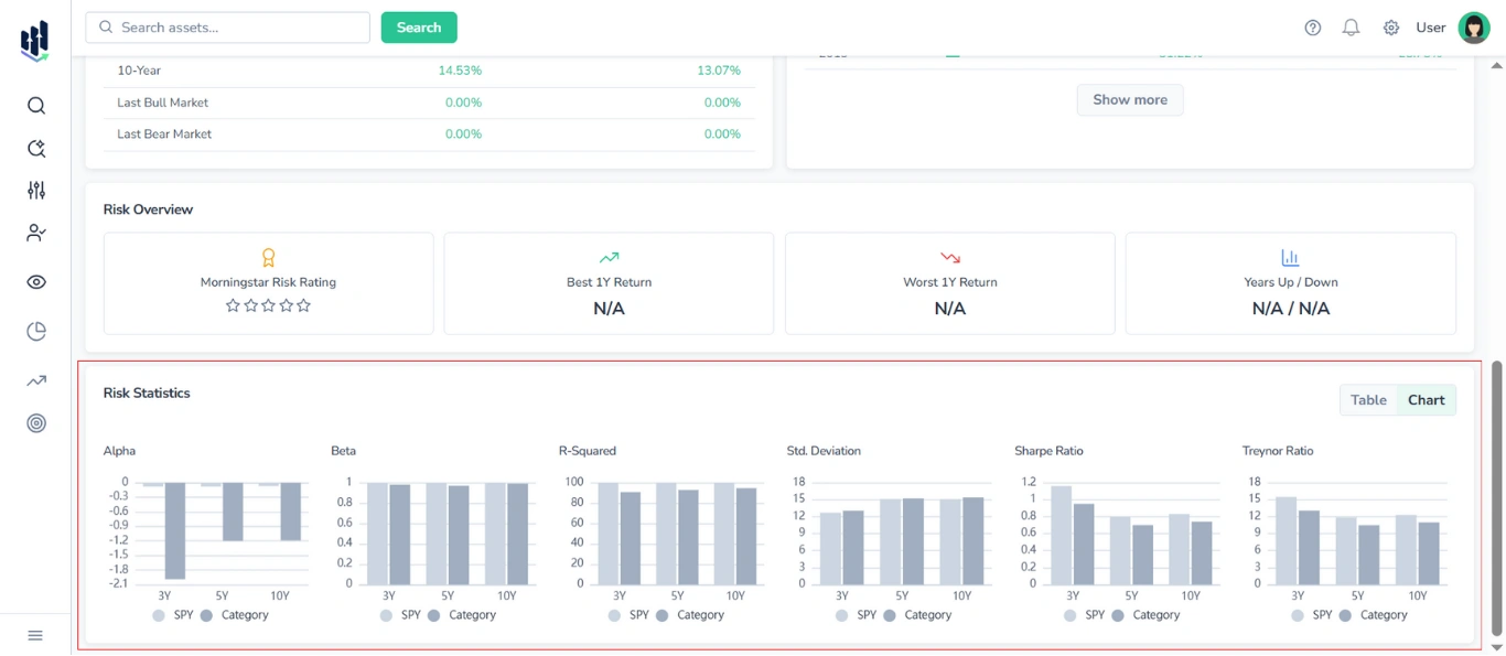
In chart mode, six separate bar charts are displayed — one for each risk metric (Alpha, Beta, R-squared, Standard Deviation, Sharpe Ratio, Treynor Ratio).
Each chart contains six bars, representing the values for the selected ETF and category averages over 3-year, 5-year, and 10-year periods. ETF and Category values are shown in distinct colors for clear comparison.
3. Statistics & Risk Tab Content for Mutual Funds
3.1. Trailing & Load-Adjusted Returns vs Category Table
Presents a unified table comparing the fund’s trailing returns, load-adjusted returns, and rank in its category against the average returns of its peer group.
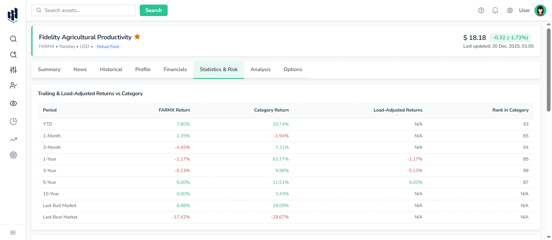
Columns included:
- Period
- Fund Return
- Category Return
- Load-Adjusted Return
- Rank in Category
The table enables a detailed performance assessment across multiple timeframes:
- YTD
- 1-Month
- 3-Month
- 1-Year
- 3-Year
- 5-Year
- 10-Year
- Last Bull Market
- Last Bear Market
Note: Values are color-coded — green for positive performance, red for negative performance, making it easy to visually identify trends and outliers.
3.2. Annual Total Return & Quarterly Return (History) Table
Displays annual and quarterly returns for the selected mutual fund and its category benchmark.
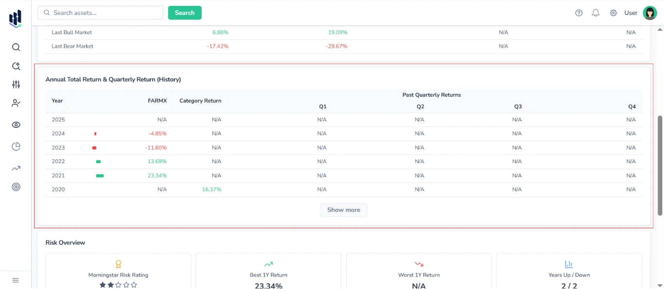
Columns included:
- Year
- Progress bar
- Fund Return
- Category Return
- Past Quarterly Returns (Q1, Q2, Q3, Q4)
Additionally, to visually indicate performance trends, positive values are highlighted in green and negative values are highlighted in red.
Note: By default, 5-10 years are shown, click Show More to expand.
3.3. Risk Overview Block
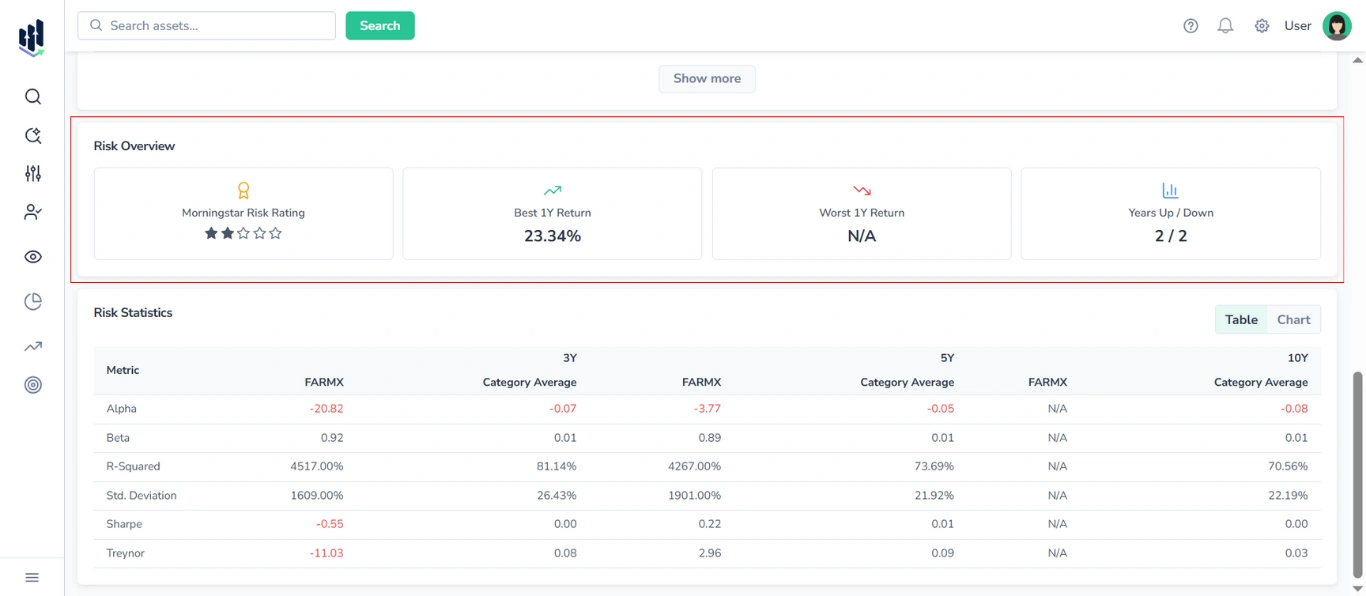
Presented as a set of four cards, it displays the following risk and performance metrics:
- Morningstar Risk Rating (stars)
- Best 1Y Return
- Worst 1Y Return
- Years Up / Years Down
3.4. Risk Statistics Section
Provides a comparative analysis of key risk metrics for the selected fund and its category benchmark, covering three time horizons:
- 3Y, 5Y, 10Y
You can switch between a table view and a graphical (chart) view of the data with the switcher in the top-right corner of the section.
3.4.1. Table View
The table displays the following metrics:
- Alpha
- Beta
- R-squared
- Standard Deviation
- Sharpe Ratio
- Treynor Ratio
For each time horizon, two columns are shown:
- Selected fund (by ticker)
- Category Average
3.4.2. Chart View
In chart mode, six separate bar charts are displayed — one for each risk metric (Alpha, Beta, R-squared, Standard Deviation, Sharpe Ratio, Treynor Ratio).
Each chart contains six bars, representing the values for the selected mutual fund and category averages over 3-year, 5-year, and 10-year periods. Fund and Category values are shown in distinct colors for clear comparison.